Displaying error message is one of the most basic functions of an application, but can also be easily overlooked because we are often focused on the core functions of the application. There are numbers of ways to present the error messages, but in my opinion there are basically 3 objectives we want to achieve with error message and as long as the design can fulfill those, it is a decent one.
Objectives of error message
The 3 objectives of error message are to make it easier for the users to:
- Know there is an error
- Know what is having error
- Know how to correct the error
In my past projects, form page and listing page are 2 most common pages that display error messages. I will share some ideas on each of them below.
Error message on form page
On a form page, I have pretty much used the following 3 ways to represent error messages:
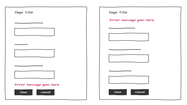
Error message on top or bottom
Good for a simple form. For example, login page.
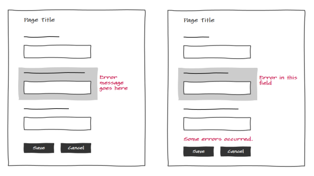
Error message next to a field
Useful to help users to find the fields that need to be corrected, but if the correction instruction is long, page’s layout will suffer.
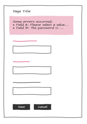
Error messages all displayed in a single block on top
Useful when instruction for correction is so long that putting it within the form will break the layout. Combined with highlighting the problematic fields can help users find the fields quickly and view all instructions in one place.
I feel these 3 ways are sufficient to cover all scenarios. I can just pick one of them based on the actual situation.
Error message on listing page
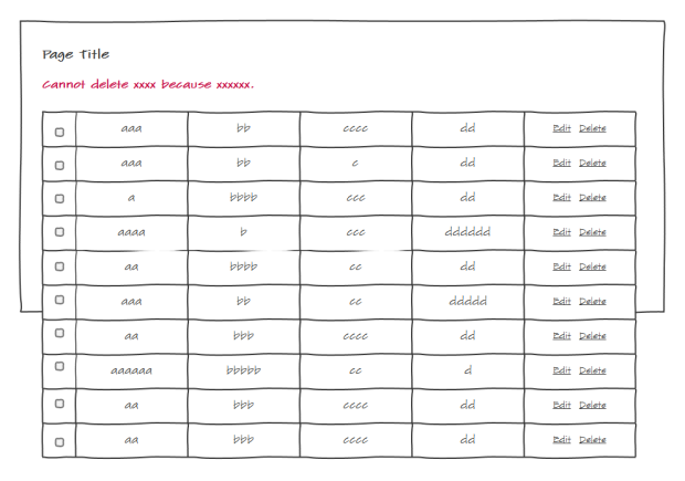
Listing page is a page that contains a list of records. This page type is different than a form page because the page is often long and each record often has its own action buttons, e.g. edit, delete, which could trigger error message. Because of this, there is one more thing needs to be accounted for – whether we need to maintain the current view of the user.
allows user stay or return to where she was
Consider a page with a very long list of records. When operating on one of the records, an error occurs and the page scrolls to the top or bottom where an error message is displayed. After reading the error, the user will have difficulty to find where the original record is.
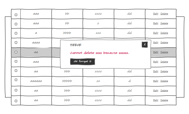
It is a good practice to always consider whether to maintain the user’s current view for it is very likely the user will continue to work on the record or the records next to it after seeing the error. In order to maintain the view of the page, I use an in-page pop-up window to display the error.
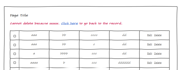
But of course there are other ways. For example, you can add a link in the error message to allow the user to go back to the problematic record.
There are downsides, however, the pop-up dialog requires the user to click the close button in order to continue, and the ‘link’ approach scrolls the page back and forth. But I will say they are decent designs as they fulfill all 3 objectives of error message.
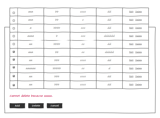
Listing page does not always require to maintain the view. For example, many listing pages offer action buttons such as a Batch Deletion button. Users can select multiple records and delete them at once. In the case, displaying the error message next to the action button is more common.
In this post I shared my thoughts on the error message’s objectives, which can be a starting point to develop a good error message design. Also I shared a few designs from my past projects. Hopefully these can inspire and help people on their own projects.
